
Linear Regression (Part 1): Why It Still Works and How It Actually Works
A practical guide to understanding the line of best fit, model assumptions, and why this simple model remains powerful

Introduction
Linear regression is one of the simplest models in data science—and one of the most widely used.
In a world of increasingly sophisticated models—gradient boosting, deep learning, and large language models—it’s natural to ask:
👉 Why does linear regression still matter?
The answer is simple: it works surprisingly well in many real-world situations.
Linear regression is fast, interpretable, and often provides a strong baseline. More importantly, it forces you to think clearly about relationships in your data—what drives what, and by how much. This clarity is something more complex models often trade off for performance.
In practice, many problems don’t need complexity. A well-specified linear model can capture the majority of the signal, especially when relationships are approximately linear or when interpretability is critical.
This is also why linear regression shows up frequently in interviews. It’s not just about the model—it’s about whether you understand how models work, what assumptions they rely on, and how to reason about them.
In this article, we’ll focus on the foundations:
what linear regression is
how the line of best fit is determined
what assumptions the model makes
The goal is not to memorize formulas, but to build an intuitive understanding of how the model works and when it can be trusted.
What Is Linear Regression? (An Intuitive View)
To make this concrete, let’s start with a simple example.
We’ll use a small dataset where we try to understand how TV advertising spend relates to sales. Each row represents a different market, with how much was spent on TV ads and the resulting sales.
Let’s first load the data:
import pandas as pd

url = "https://raw.githubusercontent.com/selva86/datasets/master/Advertising.csv"

df = pd.read_csv(url, index_col=0)
df.head()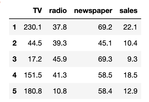
Now let’s visualize the relationship between TV spend and sales:
import matplotlib.pyplot as plt

plt.scatter(df['TV'], df['sales'])
plt.xlabel('TV Spend')
plt.ylabel('Sales')
plt.title('TV Spend vs Sales')
plt.show()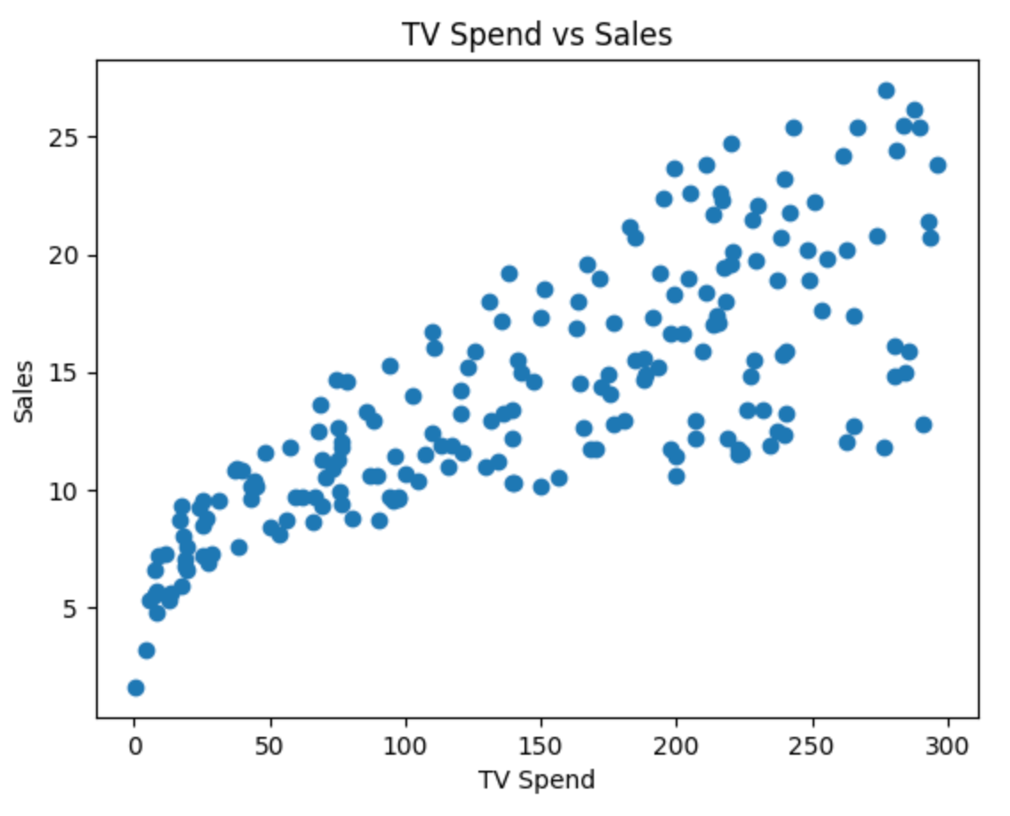
Each point in this plot represents an observation. On the x-axis, we have how much was spent on TV advertising, and on the y-axis, we have the resulting sales.
At a glance, you can already see a pattern:
👉 As TV spend increases, sales tend to increase as well.
But this relationship isn’t perfectly clean. The points don’t lie on a straight line—they’re scattered around. This is because real-world data always has some amount of noise and variability.
This is where linear regression comes in.
👉 Linear regression tries to capture this relationship with a simple line.
The idea is straightforward:
We assume that sales can be explained (at least partially) by TV spend
We try to draw a line that best represents the overall trend in the data
This line won’t pass through every point, but it should summarize the general direction of the relationship.
In other words:
👉 Linear regression helps us move from a scattered set of points to a simple, interpretable relationship between variables.
This gives us two powerful capabilities:
Understanding → how changes in TV spend affect sales
Prediction → estimating sales for a given level of TV spend
In the next section, we’ll make this idea more precise by understanding what we mean by the line of best fit—and how the model actually finds it.
The Line of Best Fit
From the previous section, we saw that the data forms a pattern—but it’s scattered. The goal of linear regression is to summarize this pattern with a single line.
👉 This line is called the line of best fit.
What Does “Best Fit” Mean?
The line of best fit is the line that best represents the relationship between the input (TV spend) and the output (sales). But what does “best” actually mean?
It means:
👉 The line that minimizes the difference between the actual values and the predicted values.
These differences are called residuals:
Since some residuals are positive and some are negative, we square them and minimize the total:
👉 This is called least squares regression.
Fitting the Line in Code
Let’s now fit a linear regression model to our data:
from sklearn.linear_model import LinearRegression

X = df[['TV']]
y = df['sales']

model = LinearRegression()
model.fit(X, y)
This gives us a line of the form:
Where:
β0 = intercept
β1 = slope
Let’s print them:
print("Intercept:", model.intercept_)
print("Slope:", model.coef_[0])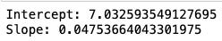
Now let’s overlay the fitted line on top of our data:
y_pred = model.predict(X)

plt.scatter(df['TV'], df['sales'], label='Actual Data')
plt.plot(df['TV'], y_pred, color='red', label='Best Fit Line')
plt.xlabel('TV Spend')
plt.ylabel('Sales')
plt.title('Linear Regression Fit')
plt.legend()
plt.show()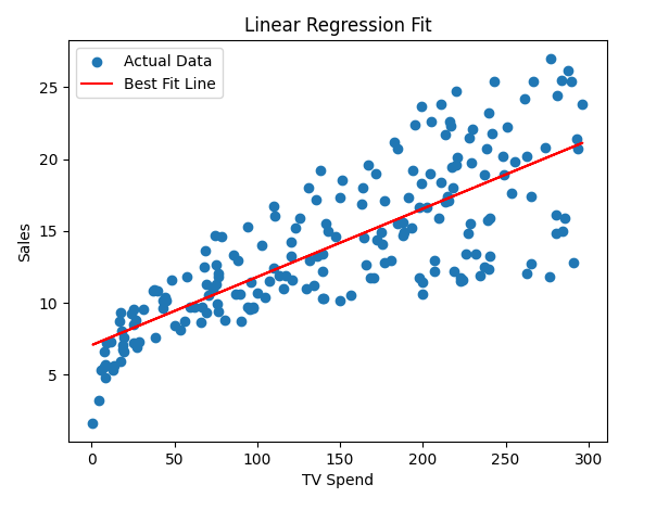
This red line is the model’s best estimate of how sales change with TV spend.
👉 For any given TV spend, the line gives us a predicted sales value.
It does two things:
Captures the overall trend in the data
Smooths out the noise
You’ll notice:
Some points lie above the line
Some lie below
That’s expected. No model is perfect.
The key idea is:
👉 The line minimizes the total squared error across all points.
What This Line Represents
This red line is the model’s best estimate of how sales change with TV spend.
👉 For any given TV spend, the line gives us a predicted sales value.
It does two things:
Captures the overall trend in the data
Smooths out the noise
You’ll notice:
Some points lie above the line
Some lie below
That’s expected. No model is perfect.
The key idea is:
👉 The line minimizes the total squared error across all points.
This simple line is doing a lot of work:
It summarizes the relationship between variables
It enables prediction
It forms the foundation for understanding more complex models
Understanding Residuals: What the Model Gets Wrong
Even though we’ve fitted a line, it doesn’t perfectly match every data point.
Some points lie above the line, and some lie below it. This difference between the actual value and the predicted value is called a residual.
Where:
yi is the actual value
y^i is the predicted value from the model
In simple terms, the residual captures how far off the model’s prediction is for a given observation.
Residuals help us understand how well the model is performing. When the residuals are small, the predictions are close to the actual values, indicating a good fit. Larger residuals suggest that the model is not capturing the relationship well for those observations.
To better understand this, it’s useful to visualize residuals:
residuals = y - y_pred

plt.scatter(df['TV'], residuals)
plt.axhline(y=0, color='red', linestyle='--')
plt.xlabel('TV Spend')
plt.ylabel('Residuals')
plt.title('Residual Plot')
plt.show()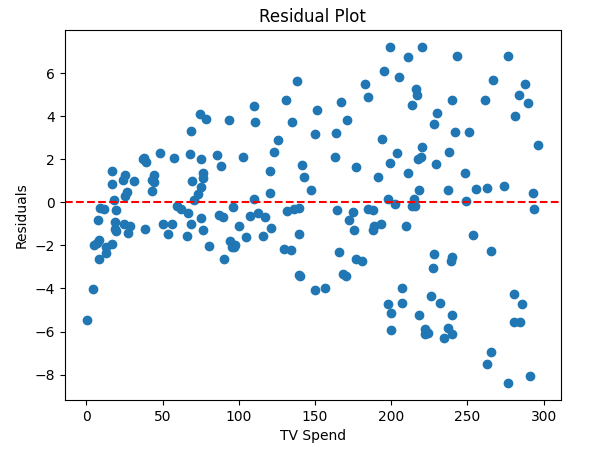
In a good model, residuals should be scattered randomly around zero without any clear pattern. This suggests that the model has captured the underlying relationship in the data.
When the model is not appropriate, residual plots often show patterns. For example:
A curved pattern suggests the relationship is not linear
A widening or funnel shape suggests changing variance
Clusters may indicate missing variables or segments
These patterns are signals that the model may need to be improved or replaced.
This is why residuals are more than just errors—they act as a diagnostic tool. They help you assess whether your model is appropriate and whether there are patterns the model is failing to capture.
📌 Pro tip: In interviews, mentioning residuals and what they reveal about the model is a strong signal. It shows that you understand not just how to fit a model, but how to evaluate it.
Model Assumptions: When Linear Regression Works
So far, we’ve seen how linear regression fits a line and how residuals help us evaluate the model. But for these results to be reliable, the model relies on a few key assumptions.
These assumptions allow us to interpret the results correctly. When they don’t hold, the model may still produce outputs—but those outputs can be misleading.
Key Assumptions
Linear regression makes a few core assumptions about the relationship between inputs and outputs, as well as the behavior of the errors:
Linearity:
The relationship between the input (TV spend) and output (sales) should be approximately linear. If the true relationship is curved or more complex, a straight line will systematically miss patterns in the data.Independence:
Observations should be independent of each other. For example, sales in one market should not directly influence sales in another. This assumption is often violated in time-series data or when there are clusters (e.g., stores in the same region).Constant Variance (Homoscedasticity):
The spread of residuals should be roughly the same across all values of the input. If variability increases with TV spend (a funnel shape), it indicates that the model’s errors are not consistent.Normality of Residuals (for inference):
Residuals should be approximately normally distributed. This assumption is less important for prediction, but matters when interpreting statistical significance (e.g., p-values, confidence intervals).No Strong Multicollinearity (for multiple variables):
When using multiple features, they should not be highly correlated with each other. If they are, it becomes difficult to isolate the individual effect of each variable.
Rather than checking each assumption separately, we can visualize them together using a diagnostic plot:
import matplotlib.pyplot as plt
import seaborn as sns
import scipy.stats as stats

residuals = y - y_pred

fig, axes = plt.subplots(2, 2, figsize=(12, 10))

# Residuals vs X (Linearity)
axes[0, 0].scatter(df['TV'], residuals)
axes[0, 0].axhline(y=0, color='red', linestyle='--')
axes[0, 0].set_title('Residuals vs TV Spend')

# Residuals vs Predictions (Variance)
axes[0, 1].scatter(y_pred, residuals)
axes[0, 1].axhline(y=0, color='red', linestyle='--')
axes[0, 1].set_title('Residuals vs Predictions')

# Histogram (Normality)
sns.histplot(residuals, kde=True, ax=axes[1, 0])
axes[1, 0].set_title('Residual Distribution')

# QQ Plot (Normality)
stats.probplot(residuals, dist="norm", plot=axes[1, 1])
axes[1, 1].set_title('QQ Plot')

plt.tight_layout()
plt.show()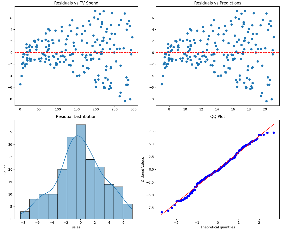
Each part of this plot helps diagnose a different assumption:
Top-left: checks whether the relationship is linear
Top-right: checks whether variance is constant
Bottom-left & bottom-right: check whether residuals follow a normal distribution
A well-behaved model will show residuals that are randomly scattered around zero, with no clear patterns and a roughly symmetric distribution.
These assumptions determine whether you can trust your model.
If they hold:
The model is stable and interpretable
Coefficients reflect meaningful relationships
Statistical measures (like p-values) are reliable
If they are violated:
The model may miss important patterns
Coefficients may be misleading
Predictions may be unreliable
This is why checking assumptions is just as important as fitting the model itself.
Closing Thoughts
Linear regression is often introduced as a simple model—but as we’ve seen, there’s more to it than just fitting a line.
From understanding the line of best fit to analyzing residuals and checking assumptions, each step plays a role in determining whether the model is actually capturing a meaningful relationship. Without these checks, it’s easy to rely on a model that looks reasonable on the surface but fails to represent the data accurately.
The goal of this first part was to build that foundation—how the model works and when it can be trusted. Once you have that clarity, the next step becomes much more interesting:
👉 What is the model actually telling us?
In Part 2, we’ll focus on interpreting the results—breaking down coefficients, p-values, and R-squared, and understanding how to use them to make decisions.
What’s Next
In the next issue, we’ll have a Part 2 where the focus will be on interpreting the results—breaking down coefficients, p-values, and R-squared, and understanding how to use them to make decisions.
Keep building, keep learning—wishing you the best in your data journey.